
 After 8 years the MOTIf website was starting to show it’s age, visually at least.
While I have performed regular technical updates to keep it browser compatible and futureproofed, we made a fixed-layout decision (rather than fluid) in 2007 and so has it never worked well on these newfangled smart phones and phablet whotnots. Sadly though, the main driver for the recent redesign was actually a need to distance ourselves from some unscrupulous people tacitly claiming the site was their own! We decided it was time to rebrand the site, and introduce the key people in the team on a new “About Us” page – the site has previously had somewhat of an air of mystery behind it, for… reasons (as the kids say nowadays).
So I thought it was time for a complete front-end rebuild, and dusted off everything I learned while working at Deepend building what were cutting-edge responsive sites (three or four years ago now). We spent huge efforts pioneering in this field, and even built our own front-end framework/reset/bootstrap.
Seeing as I’m working voluntarily on the site now, my time is a scarce resource so I decided to stand on the giant’s shoulders of Twitter Bootstrap – replacing the good work that Blueprint served the site since 2007. Blueprint was great as a reset and grid system, but came before responsive design had been invented and would have required an m-site (remember those?). TBS 4 is about to come out but it’s not even in RC yet, so I chose TBS3 which I’m relatively familiar with. (The only thing I don’t like about TBS is it comes with “style” which you have to get rid of, rather than it being a purely vanilla reset and grid framework.)
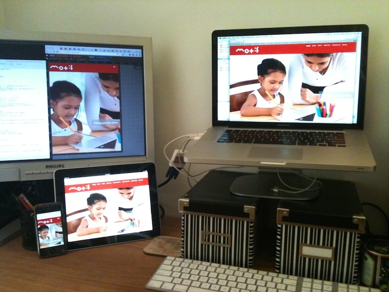
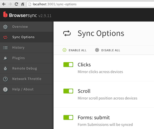
One of the great tools we used at Deepend was BrowserSync which upgrades you into the robot octopus required for responsive testing on multiple devices. It automatically reloads the pages after you’ve edited the source, but also sync’s the navigation and even scrolling across all devices – it’s quite amazing to see it working.
While pondering a new front-end build, I realised I’ve now changed allegiences from Grunt to Gulp. I was a great fan of Grunt, so the transition was hesitant but there is a certain beauty and simplicity to the concept of Gulp in which I’m more keen to invest time (than learning more ad-hoc config formats). I’ve been using it recently with a node.js/redis application (SciWriter – coming soon!) and it just feels more like an integral part of the system, being in Javascript and allowing interopability with the server codebase if required. Also the logo is far less frightening.
I was pleased to see there is now an official version of Bootstrap w’ SASS, (rather than the previous third-party version), as I’m more a fan of SASS than LESS. To be honest I can’t remember the details of why now, but after a couple of years of trying both in dozens of projects at Deepend we all plumped for SASS as the marginally superior platform.
To get SASS building in Gulp, I ditched my previous ally Compass for gulp-ruby-sass. I found it relatively tricky to wire up the SASS build as the twbs/bootstrap-sass documentation has myriad options including combinations of Rails, Bower, Compass, Node, Sprockets, Mincer, Rake… aagh what! But after thinking it through and a short walk around the block I found gulp-ruby-sass was the right choice for me – as I am using Bower and Gulp.
Once the set of dependencies and technologies were chosen, the actual install ended up quite straightforward:
- update/install Ruby, Node, NPM etc.
- install Bootstrap with Bower
- install Gulp with Node NPM
- install Browsersync and Ruby-SAS into Gulp
I set up a src folder in the site with some news .gitignore’s for bower_components, sass_cache and node_modules, and then created a JS and CSS build in the gulpfile.
As I am migrating an existing site, I decided to use the SCSS format (rather than SASS). The great thing about SCSS being a superset of CSS is that I could just drop the original 2007 motif.css (designed over Blueprint) into the src/scss directory and start migrating to the new site. I much prefer a format closer to CSS and I am not much of a fan of oversimplified syntax transpilers such as Coffeescript. It just feels like yet another language to learn, and takes your knowledge further from the the true W3C stack – all for a few braces?
Now I was ready to splice the BS3 “starter” template header into the site’s header view template, fiddle around a little with the JS/CSS imports and see what the site looked like for fun… I was actually pretty amazed to see the site looked relatively intact and was already responsive! I believe this is testament to the semantic markup approach of both BS and my previous work on the site – the old and new CSS didn’t conflict directly, but intermingled relatively harmlessly.
Now the job was to go through the original CSS and HTML finding any specific classes (and div structures of course) for Blueprint or my custom elements like rounded corners from years before border-radius. (I did chuckle when the major browser finally implemented border-radius and box-shadow – just in time for flat design.) This was the “easy but long” task, after the quick wins of importing such power from all these great frameworks.
I am truly appreciative of tools such as Bootstrap, Gulp, Bower and SASS. Over the 30+ years I’ve been developing I have implemented similar frameworks or solutions for myself or my teams, before they existed publicly. I know how hard they are to get right. It’s a real pleasure to use well designed tools built by people who really know what they’re used for. Plus it’s a relief not to have to build it myself again as languages shift in and out of fashion! (Ah the memories, that old Perl CMS… countless templating systems… the time we cleverly named “Deepstrap” then immediatley regretted Googling the name for trademarks.)
Getting BrowserSync to work perfectly took a couple of attempts. I saw the “inbuilt server” wasn’t useful to me as I have a CMS and backend and it only serves flat HTML. So I tried the proxy, but it replaced all my nice SEO URLs and local domain with simple IP addresses, which defeated the routing. So I eventually built the snippet injection into my application itself – i.e. my web application is now “Browsersync Aware”.
To do this, I first added a controller parameter to enable browserSync in a session, but then also configured it to be always-on in the DEV deployment (avoiding having to enable it in many devices, but still allowing occasional debugging in production). My body template is now rendered thus:
<body <?= isset($body_id) ? 'id="'.$body_id.'"' : '' ?>>
<?= isset($browserSync) ? '<script async src="//'.$_SERVER['SERVER_NAME'].':3000/browser-sync/browser-sync-client.2.9.11.js"></script>'  : '' ?>
The gulpfile is still evolving, but this is how it currently works. Everything is built on-change via watch and deployed directly to the site directories.
// MOTIf Front-end src build - Gulp file

// Define base folders
var src = 'src';
var dest = '..';

var gulp = require('gulp');
var concat = require('gulp-concat');
var rename = require('gulp-rename');
var uglify = require('gulp-uglify');
var sass = require('gulp-ruby-sass');
var debug = require('gulp-debug');
var browserSync = require('browser-sync').create();


// JS build
gulp.task('scripts', function() {
 return gulp.src(src+'/js/*.js')
  //  .pipe(debug({title: 'debugjs:'}))
  .pipe(concat('main.js'))
  .pipe(rename({suffix: '.min'}))
  .pipe(uglify())
  .pipe(gulp.dest(dest+'/js'))
  .pipe(browserSync.stream())
  ;
});

// CSS build
gulp.task('sass', function() {
 //return sass(src+'/scss/**/*.scss', {verbose: false})/* NB: glob fixed a frustrating "0 items" problem! */
 return sass(src+'/scss/styles.scss', {verbose: false})// prevent multi-compile of includes in this folder - it's a pure tree.
  .on('error', function (err) {
   console.error('Error!', err.message);
  })
  //.pipe(debug({title: 'debugsass:'}))
  .pipe(rename({suffix: '.min'}))
  .pipe(gulp.dest(dest+'/css'))
  .pipe(browserSync.stream())
  ;
});

// hawtcher bee watcher
gulp.task('watch', function() {
 browserSync.init({
  notify: false // the "connected to browsersync" message gets in the way of the nav!
 });
 gulp.watch(src+'/js/*.js', ['scripts']);
 gulp.watch(src+'/scss/*.scss', ['sass']);
 gulp.watch('../system/application/views/**/*.php').on('change', browserSync.reload);
 gulp.watch(src+'/images/**/*', ['images']);
});

// Go!
gulp.task('default', ['scripts', 'sass', 'watch', 'browser-sync']);
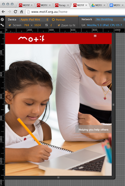
Another useful responsive developer tool is the Chrome device-simulator which performs viewport and user-agent spoofing. However be warned that it doesn’t accomodate the extra cruft the actual device browsers incur such as address bar, tabs, status bar etc. so the actual viewports will be significantly smaller. Real device testing is still the only way to be sure, but paid services such as BrowserStack can also help automate this.
There’s still a way to go with the redesign. I’ve only redesigned the public-facing pages not the inner areas where the tests are done, but I’m pretty pleased to bring the site (almost) up to date, and therefore to allow the experimenters to administer these tests on more convenient devices.
With over 5,000 registered professionals and 12,000 children tested so far, the site has gradually become a valuable resource to many teachers and clinicians. I want to ensure it’s kept usable and useful into the future, for the next generation of kids who’ll need help with learning to read and write.
